Cupcake Design System
A design system is a product that supports other products. With that approach, we have embraced metrics, rituals, research and continuous iteration, resulting in HTML/CSS components, which can be used across all products, regardless of the underlying framework.
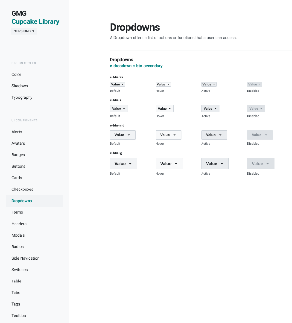
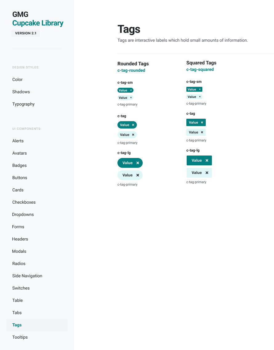
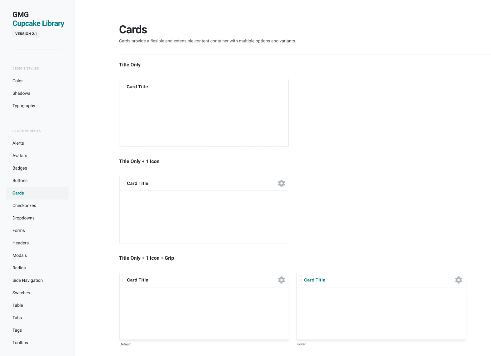
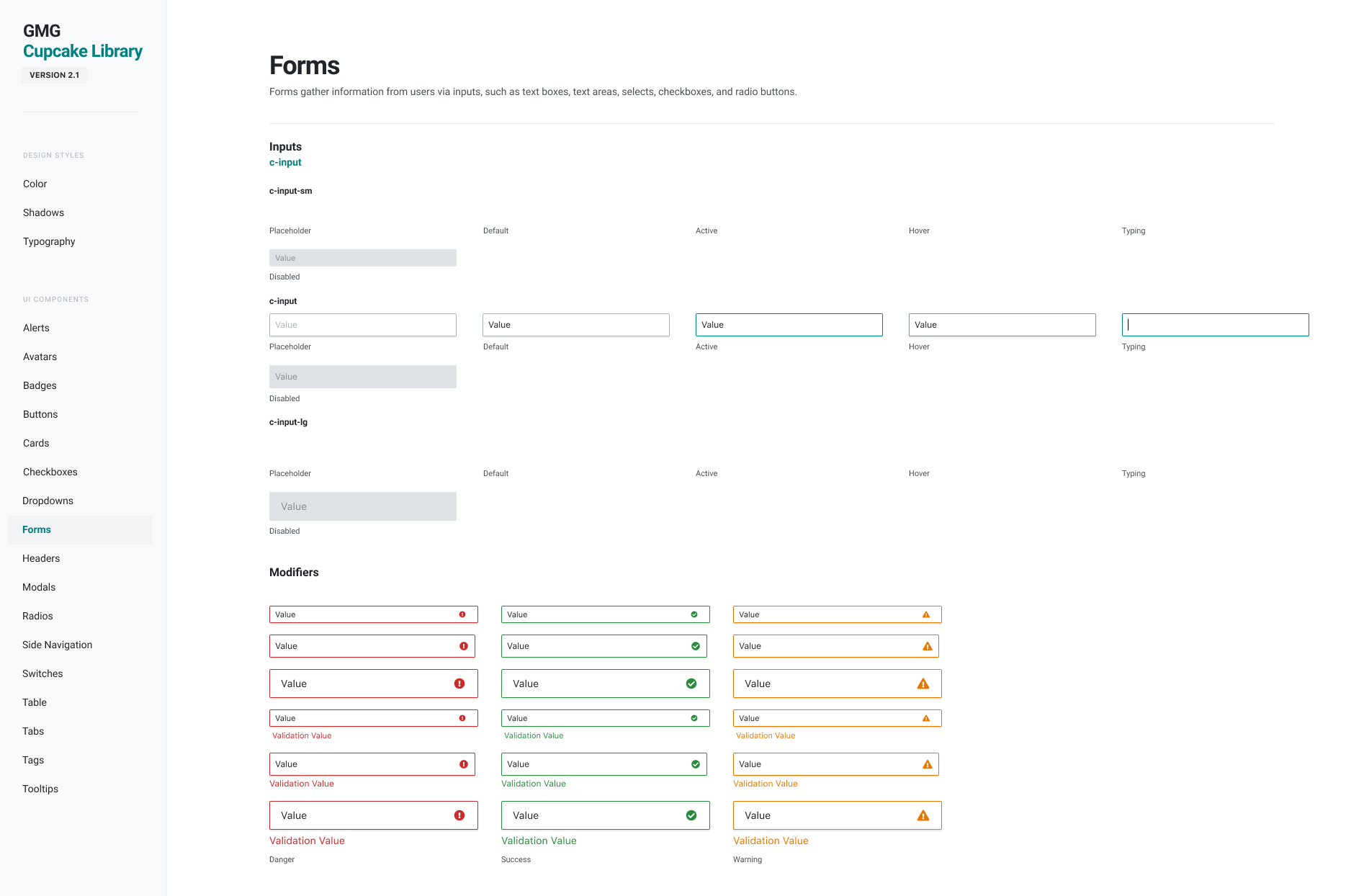
The Cupcake Design System provides developers with a collection of reusable HTML and SCSS partials and Angular components (known as “Sprinkles”) to build first class user interfaces.
Rather than focusing on pixels, developers can focus on application logic, while designers can focus on user experience, interactions, and flows.
These elements, components, and patterns provide a unified language and consistent look and feel when designing apps and products within the IHS Markit ecosystem.
View the Cupcake Design System.
Documentation
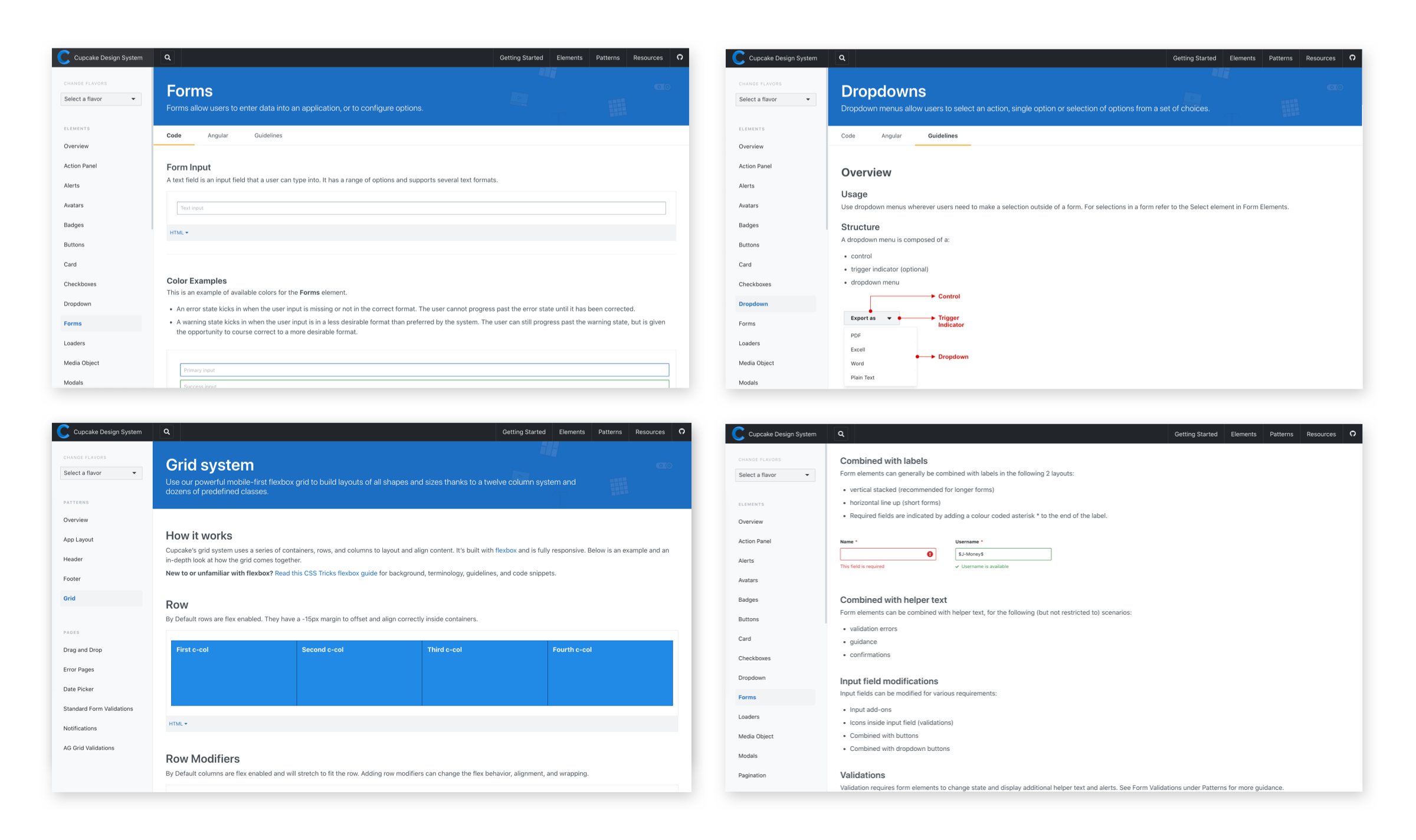
Building a design system is hard...using a design system should be easy. As part of my role at IHS Markit, I created and maintained the design system documentation. The Cupcake Design System documentation provides elements, patterns, and usage guidelines that enable collaboration between developers, designers, and product owners.
See an example.
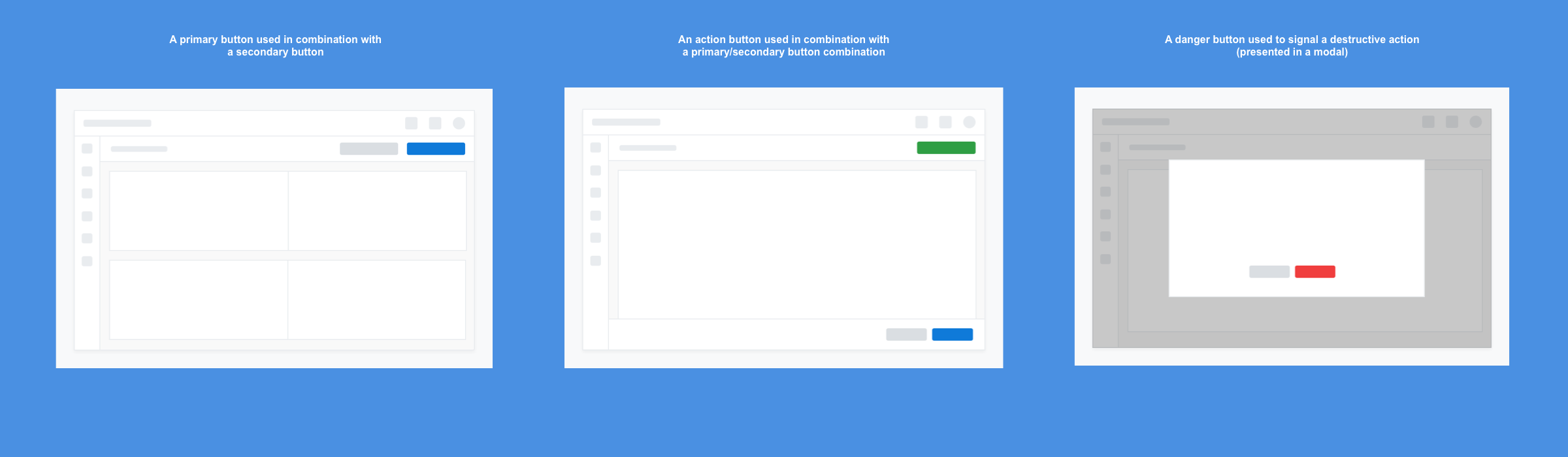
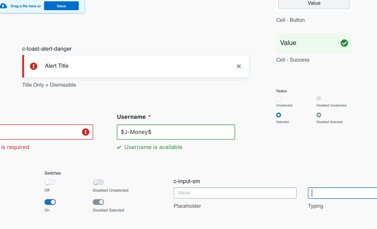
Component Library
The Cupcake Design System Component Library was originally designed and maintained using Sketch. Over time, the design team decided to transition to Figma. As part of the transition project, I created and maintained Figma components that were used for creating wireframes and user flows.