Buyside Portal
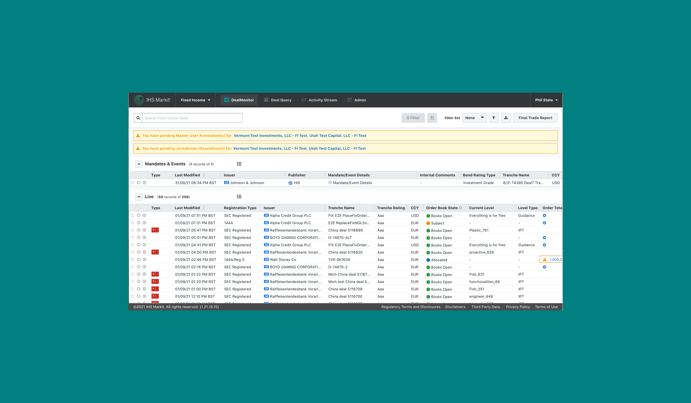
A financial product designed to provide market participants with a real-time electronic exchange of information between banks, investors and traders
Micro-interaction Improvements
A micro-interaction is an individual interaction in the product design that helps the user complete a specific task. The small details of micro-interactions are what help create the overall design, and ultimately, create joy and delight for users.
For this project, I improved dropdown micro-interactions within a financial product using the company’s internal design system components.
User Pain Points
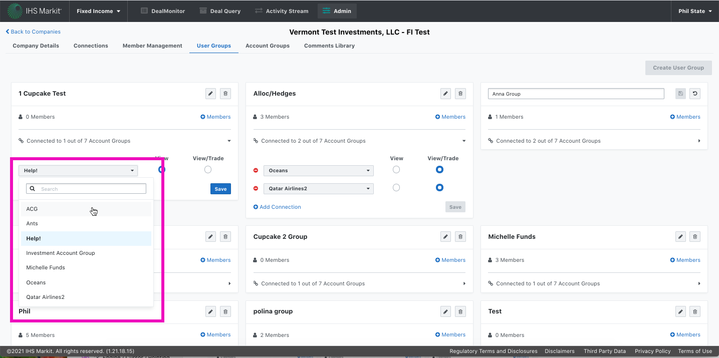
No indication that the user is hovering over a list item in the dropdown
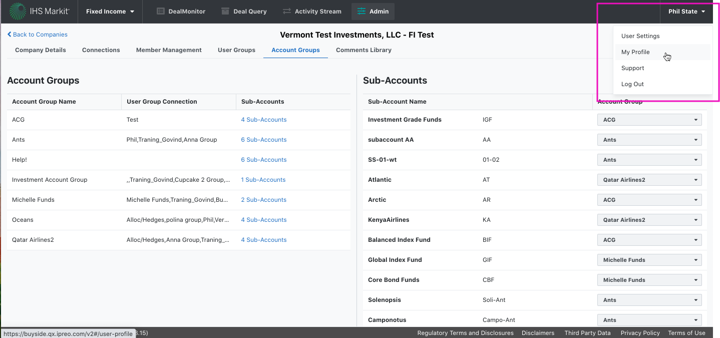
Dropdown styling is inconsistent with design system standards
No indication to the user that is the item in the list has been selected
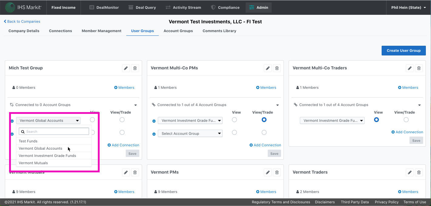
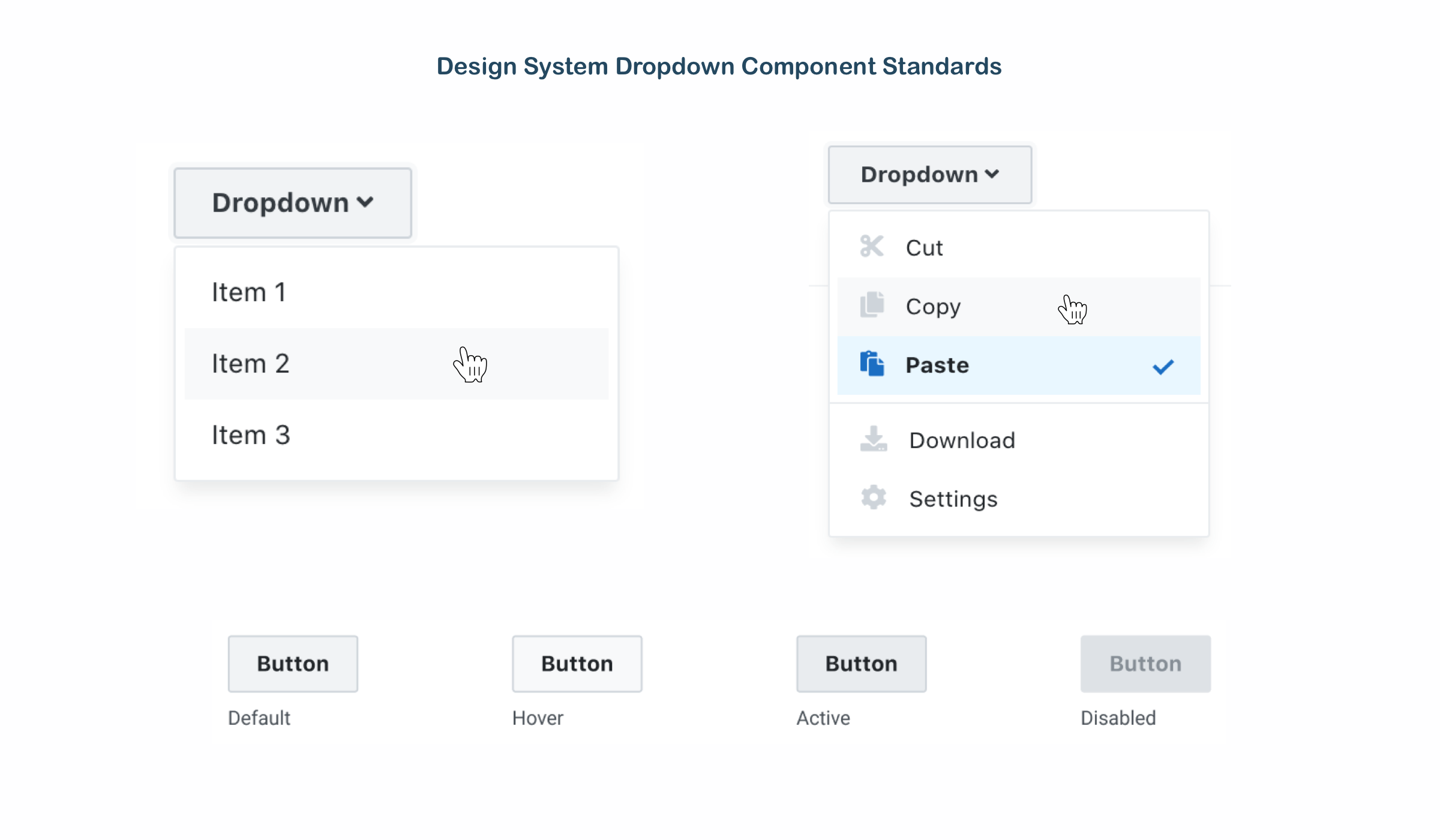
Improved dropdown interaction
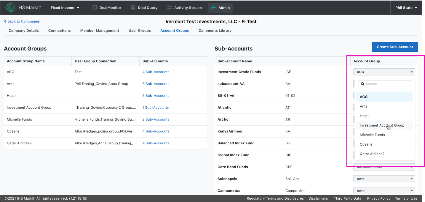
Cursor pointer appears when hovering over list items
When the user hovers over a list item, a light gray background appears
Selected item in list is denoted with a light blue background and bold text
Mouse target click area is much bigger which can reduce a users chance of accidentally clicking on the wrong list item
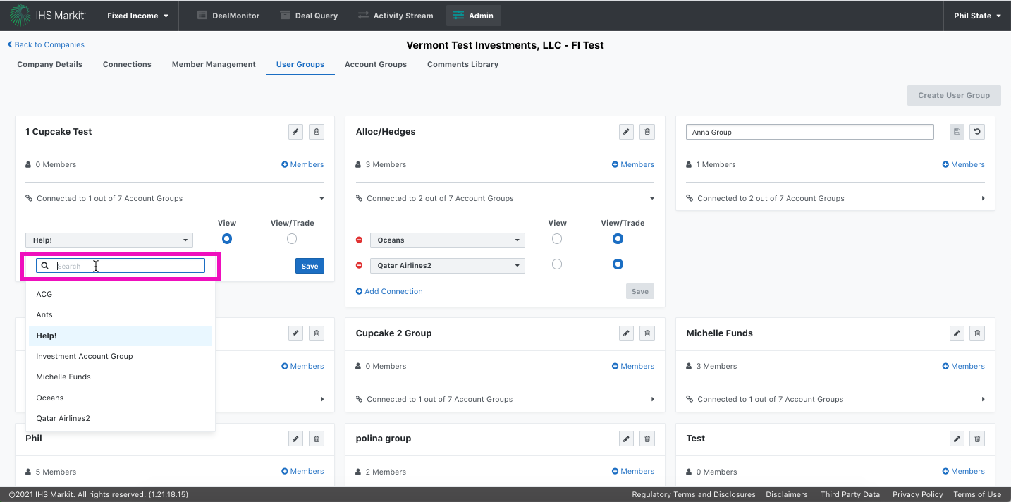
Search Box Interaction Improvement
When the user clicks into the search box:
Blue outline appears on focus
Typing cursor appears to let the user know they can type into the Search field
A consistent user experience
As the user navigates through the product and interacts with other dropdowns, they now have a more consistent experience. A more consistent user experience leads to user joy and keeps customers coming back to the Buyside Portal.